Optimizing the end-to-end purchase journey for a legacy tourism platform, resulting in a 20% reduction in cart abandonment and a streamlined mobile-first experience.


MY ROLE & SKILLS
THE TECH I USED DAILY


TEAM
3
Product Owners
1
Product Manager
2
Product Designers
1
Testers
1
Copywriter
1
Translator
PROJECT TIMELINE
2025
11 months
Chapter 01
Defining the problem space and business goals for a legacy tourism giant.
PROJECT CONTEXT
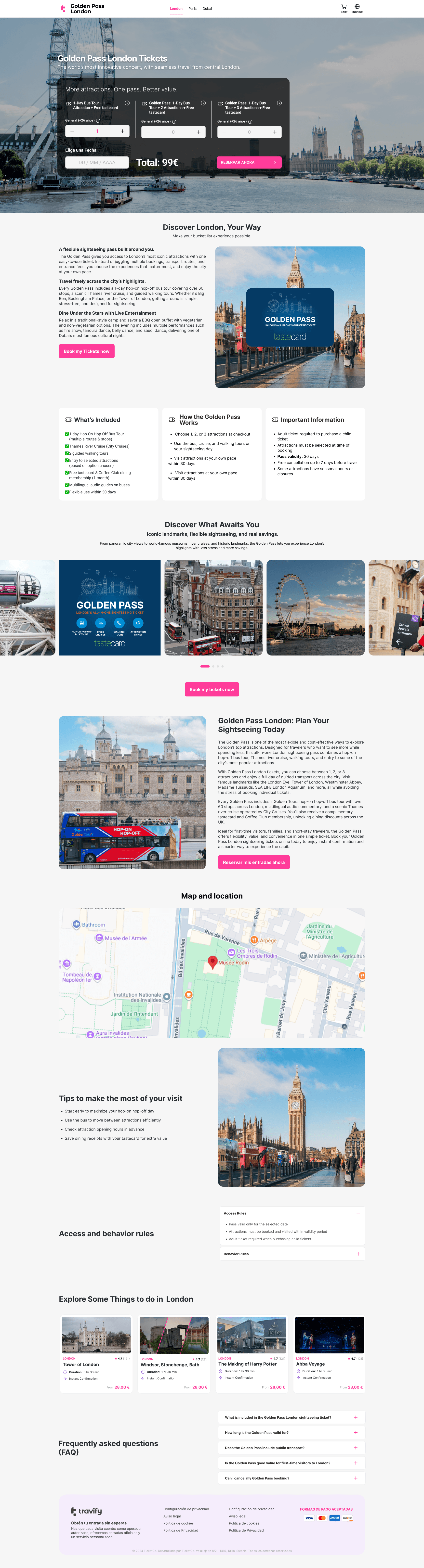
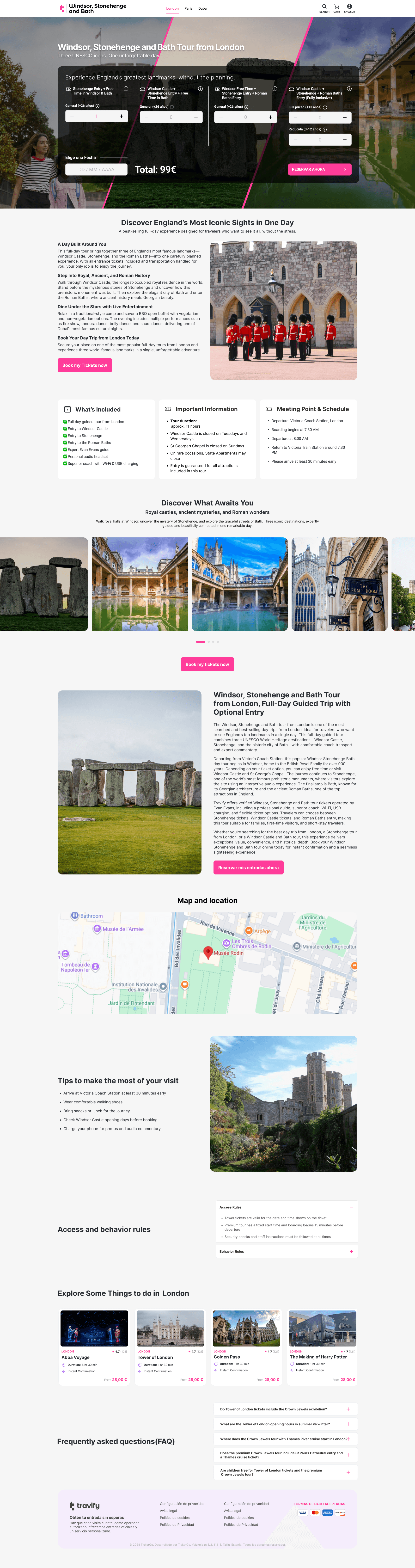
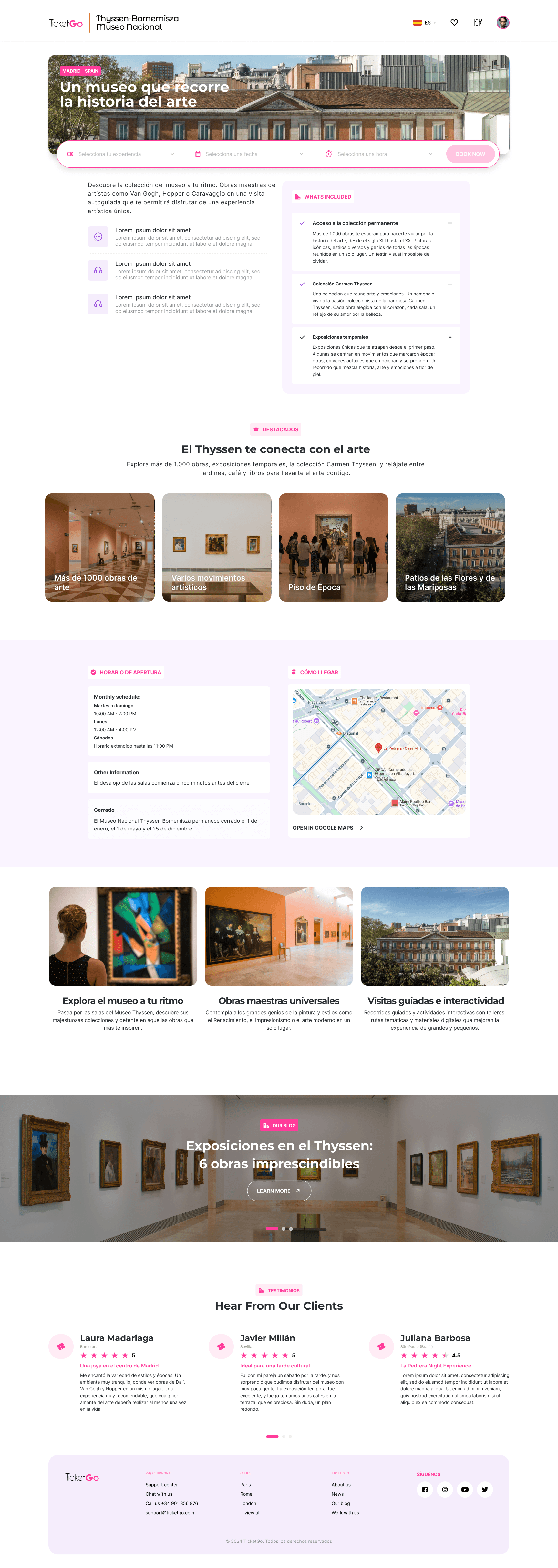
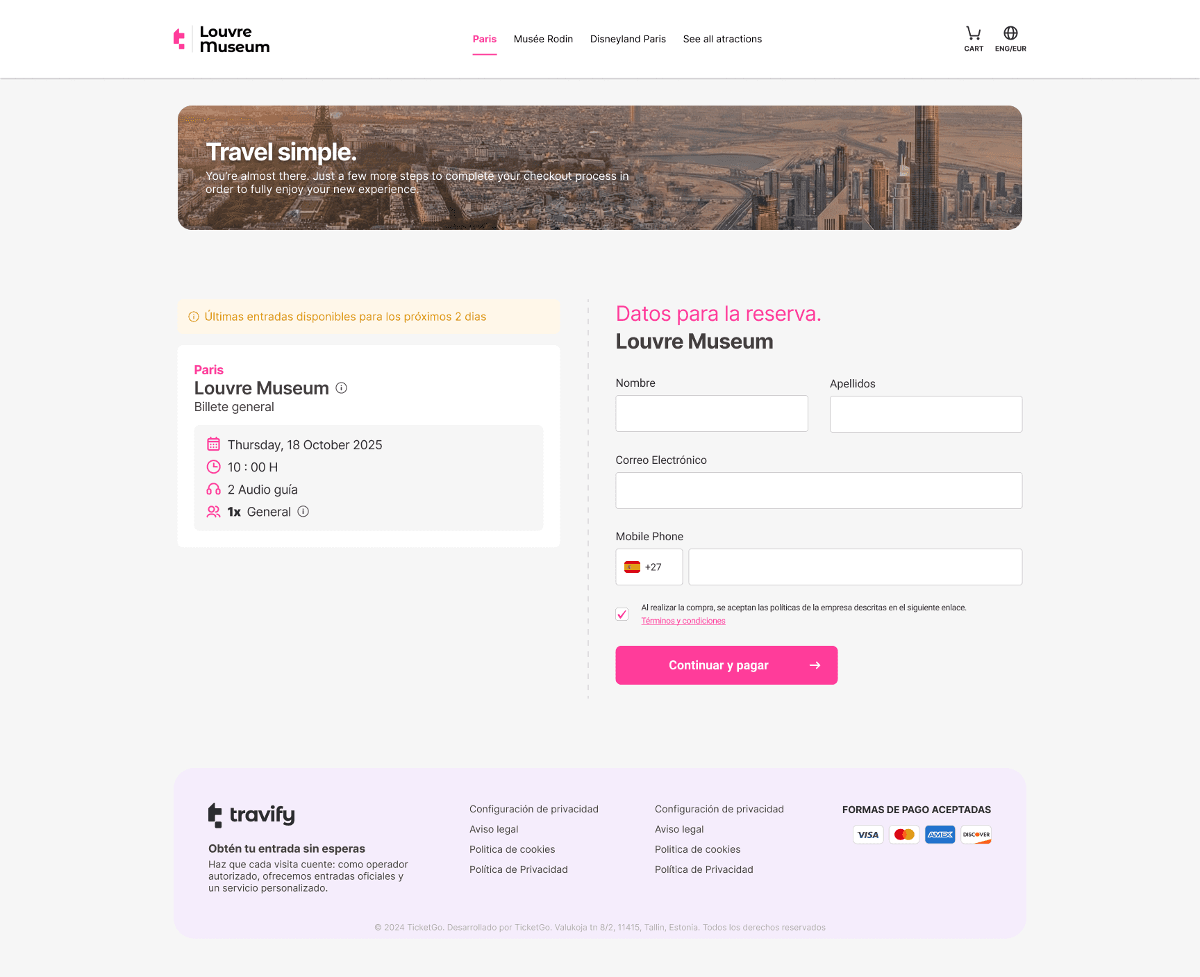
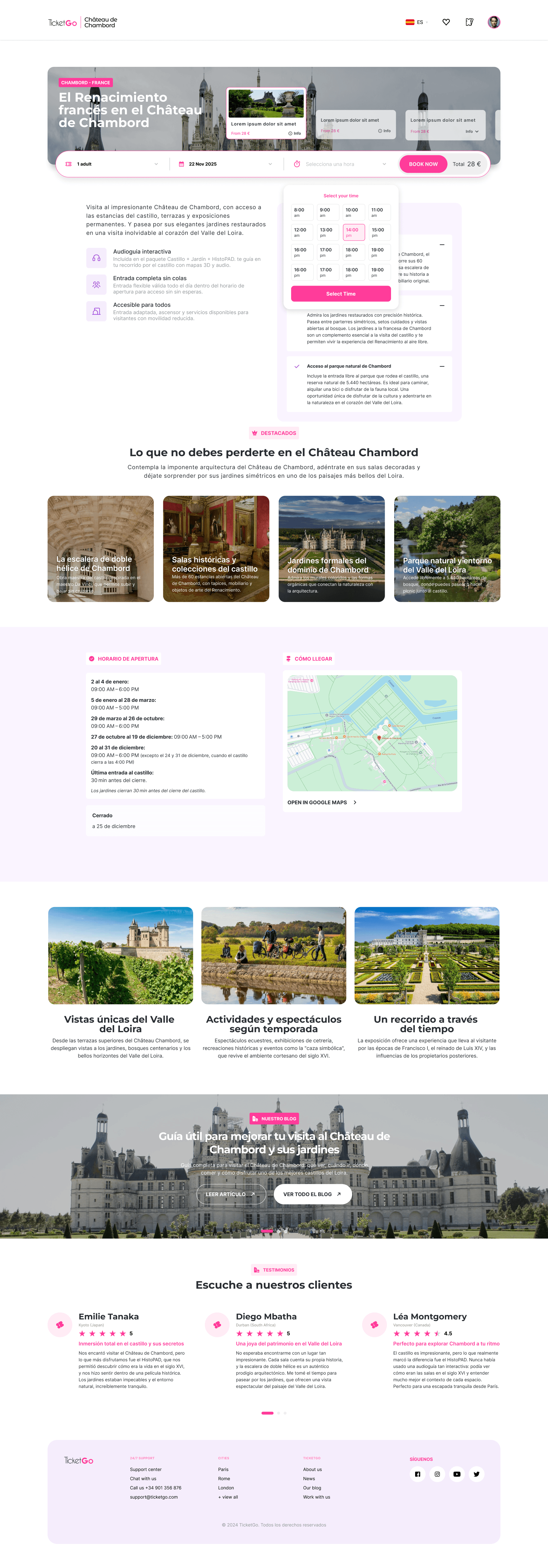
TicketGo Tourism/Travify is an online travel ticket reseller that sells entry tickets and experiences for major tourist attractions.
The goal was to reduce friction between inspiration and booking by prioritizing mobile-first discovery, transparent information, and fast checkout flows.
THE CORE CHALLENGE
This wasnt just a UX issue, it was impacting directly conversion and revenue despite a massive
traffic, the booking ecosystem was a friction-filled labyrinth.
The navigation bar lacked active state highlights, confusing user location.
The platform relied on a legacy Strapi CMS, which introduced significant limitations in layout flexibility and content structuring.
We had to design modular components that could be easily mapped to the existing data schema.
THE GOALS
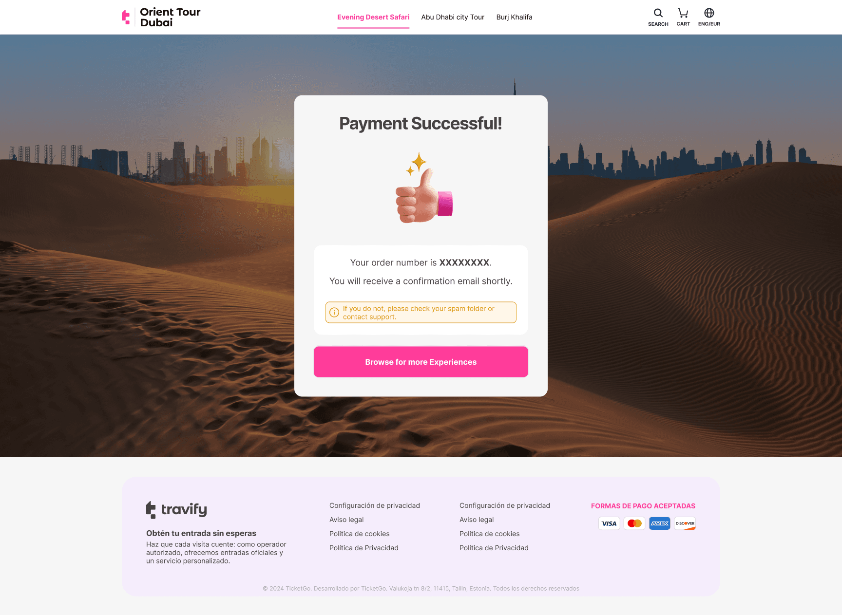
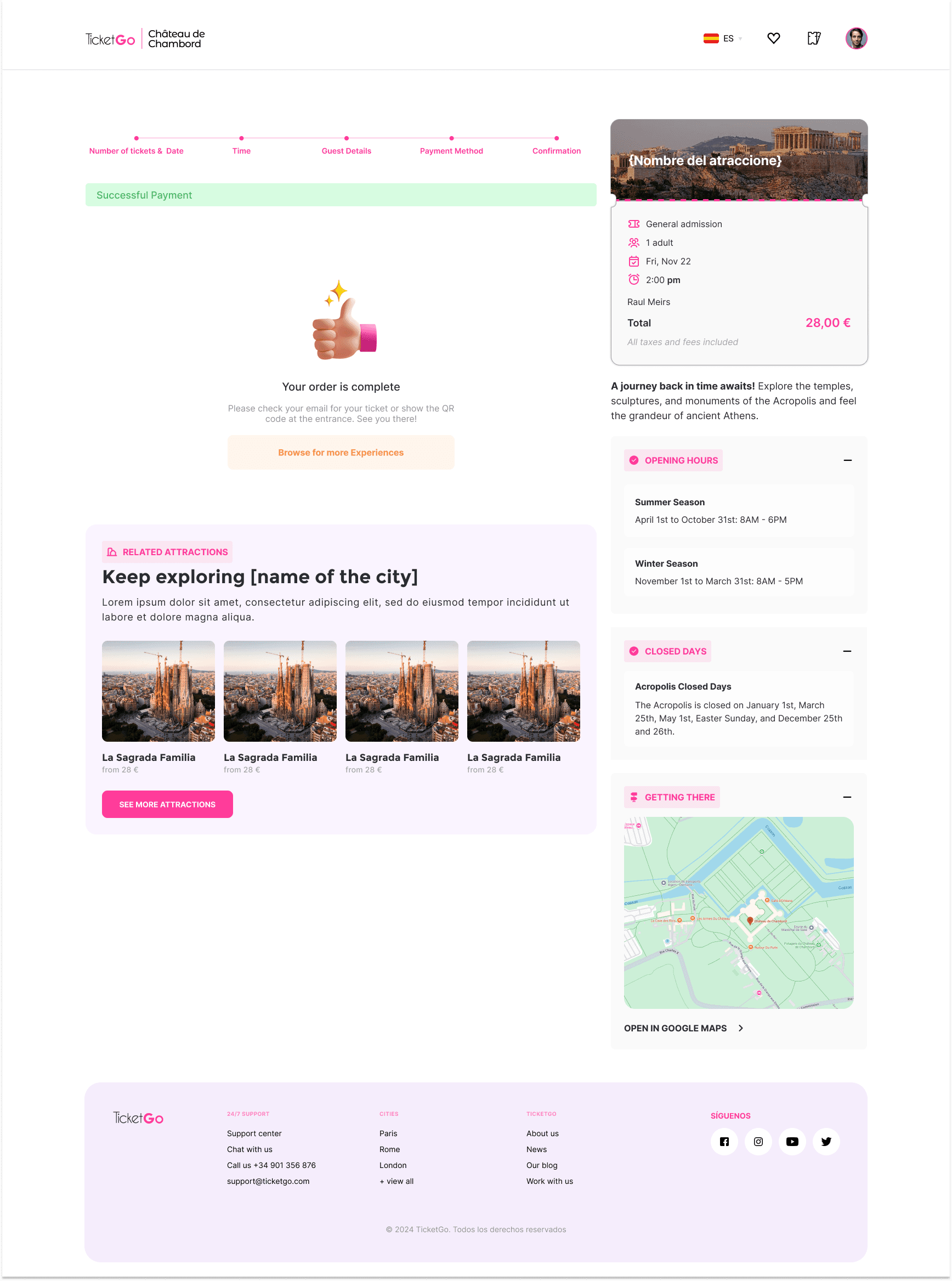
Help users complete bookings faster and with more confidence.
Remove points of hesitation during checkout.
Improve conversion by simplifying key steps in the flow.
Quickly find relevant attractions and events without friction
High mobile usage, so flows needed to be fast, responsive and low-friction.
Chapter 02


Booking Rate
Baseline conversion rate for tour bookings.
Time to complete Booking
Total duration from discovery to purchase confirmation.
Avg. Search Time
Time required for users to find a suitable experience.
Bounce Rate
Percentage of visitors leaving before interacting with listings.
Net Promoter Score
Initial measurement of customer satisfaction and brand trust.
To understand where users hesitate during the booking process, I conducted 5 structured interviews focused on real purchase behavior rather than general preferences.
The goal was to identify moments of uncertainty that lead to drop-off.
N=5
3 users who recently booked tickets online
2 users who abandoned a purchase before completion
Direct quotes
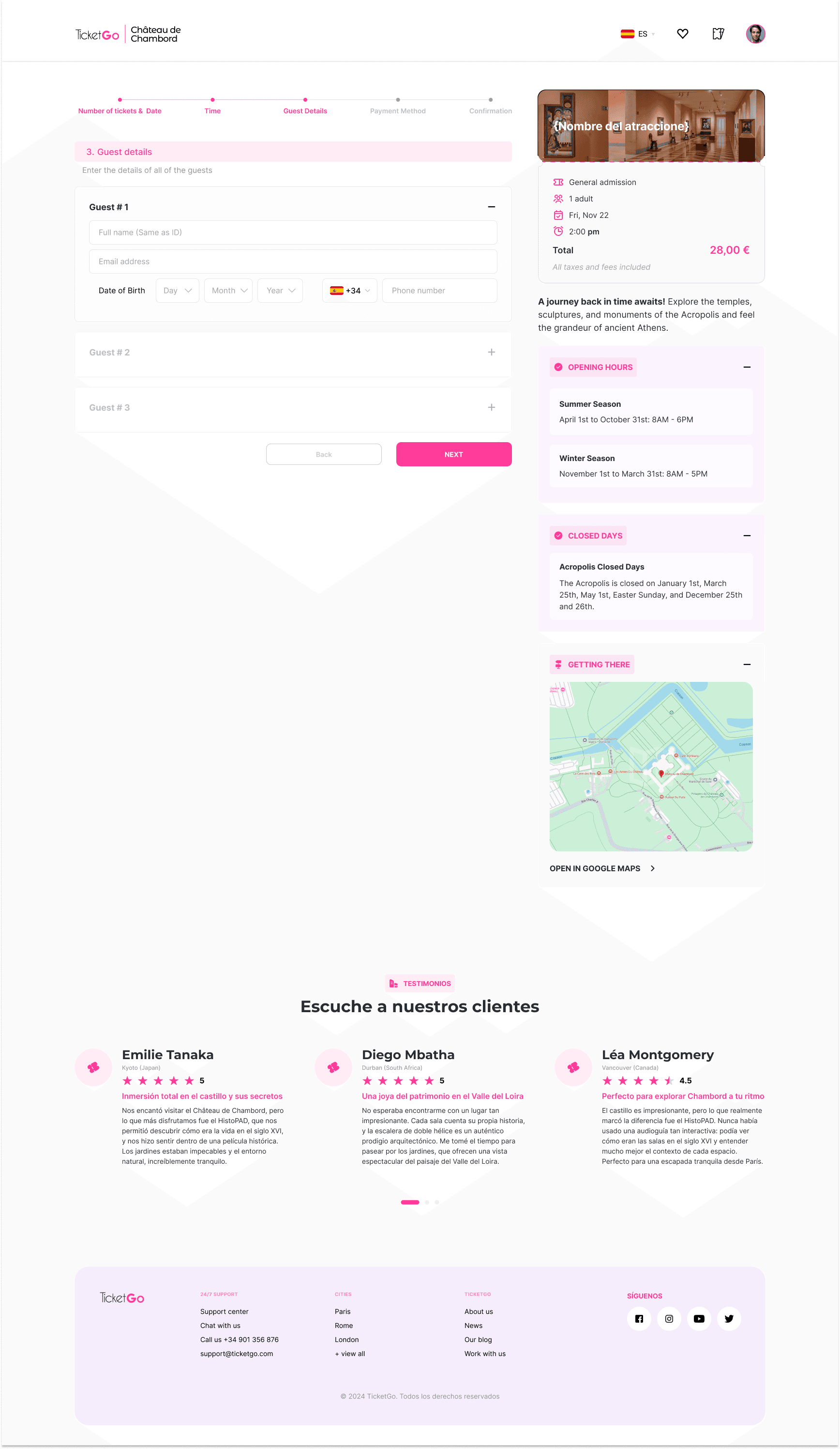
“I just want to know the final price before I commit.”
“If I’m not sure what happens after I click pay, I hesitate.”
“Too many steps aren’t a problem, confusion is.”
Insight 1
Users hesitate when the final price is not immediately clear.
Many participants paused to verify totals before continuing, and some abandoned when unexpected costs appeared late in the flow.
Insight 2
The number of steps matters less than perceived effort.
Users were comfortable with multi-step flows as long as progress felt fast and predictable.
Insight 3
Users look for confirmation signals before committing.
Lack of clarity around what happens next (payment, confirmation, refunds) increased hesitation at checkout.
Insight 3
Users look for confirmation signals before committing.
Lack of clarity around what happens next (payment, confirmation, refunds) increased hesitation at checkout.
We interviewed 5 users from different parts of the world that are recurring users both with bad reviews and good reviews to better understand what where experiences.
Legend
Top Level
Secondary level page
Third level page
Fourth level page
Fifth level page

KEY INSIGHTS


Chapter 03
Designing a high-velocity booking experience with a mobile-first approach.
We established four core principles:
Remove visual noise and unnecessary elements. Prioritize information that supports fast decision-making.
Primary actions are positioned within natural thumb reach to support comfortable one-handed use.
Design System & Consistency
As the product evolved, inconsistencies started to appear across key flows, especially in checkout. Similar actions behaved differently depending on the screen, and UI elements like buttons, spacing, and hierarchy were not always aligned.
This created unnecessary friction. Users had to reprocess interactions instead of relying on familiar patterns, which slowed them down at critical moments. At the same time, these inconsistencies made it harder for developers to implement and scale features efficiently.
Instead of only fixing individual screens, I focused on defining reusable patterns that could scale across the product.
Colors
Logos
Typography
Spacing & Borders
Grid System
COLOR PALETTE
PRIMARY
Brand Color
#FF3C9A
Pink (#FF3C9A) is a bold magenta that radiates energy and femininity. The brand's signature hue to captivate female audiences and spark excitement for event discovery. It leads the palette with strong accessibility and emotional impact.
The primary color palette is used across all the interactive elements such as CTA’s, links, inputs, active states, etc
50
100
200
300
400
500
600
700
800
900
SECUNDARY
Purple
#9F47E0
Purple (#FF3C9A) is a bold, vibrant purple with cool violet undertones. It feels modern and energetic, often associated with creativity, innovation, and a slightly futuristic edge.
50
100
200
300
400
500
600
700
800
900
NEUTRAL / GRAY
Gray
#444955
Gray (#444955) is a muted, cool-toned gray with subtle blue undertones. It feels calm, understated, and modern—often associated with stability, professionalism, and a clean, minimal aesthetic.
50
100
200
300
400
500
600
700
800
900
SEMANTICAL COLORS
These colors have a big impact on the user's experience and they are used in status indicators, error messages, etc.
SUCCESS
Success
#32C997
50
100
200
300
400
500
600
700
800
900
INFORMATION
information
#D38E13
50
100
200
300
400
500
600
700
800
900
DANGER/ERROR
Danger
#FF5A4F
50
100
200
300
400
500
600
700
800
900
WARNING
warning
#FFD596
50
100
200
300
400
500
600
700
800
900
TEXT & ICONS
Color
Name
Hex Code
Value
Headings
#111215
Neutral/800
Body
#22252B
Neutral/700
Action
#FF3C9A
Primary/default
Action-Hover
#99245C
Primary/700
Disabled
#737780
Neutral/400
Information
#33AAFF
Information/default
Warning
#FFD596
Warning/default
Success
#32C997
Success/default
Error
#FF5A4F
Error/default
On-action
#FFFFFF
Neutral/white
Surface Colors
Color
Name
Hex Code
Value
page_background
#ECECEE
Neutral/50
default_card
#FFFFFF
Neutral/white
action
#FF3C9A
Primary/default
Action-Hoover
#CC307B
Primary/600
Information
#E7EFFF
Information/100
Warning
#FFEED5
Warning/200
Success
#ADE9D5
Success/200
Error
#FFDEDC
Error/100
REFLECTION
Working on consistency reinforced that design systems are not just a visual layer, but a way to bring structure to the product itself. Defining clear patterns early helps reduce complexity over time and creates a more stable foundation for both users and teams.
Instead of only fixing individual screens, I focused on defining reusable patterns that could scale across the product.


Less complicated Ticket Widget
Requiring users to interact with six dropdowns in the "Procurar um imóvel?" section may x tedious and overwhelming.
60% Faster Booking Flow
Reduced completion time from 4 minutes to under 90 seconds.
Intuitive Navigation:
The navigation bar lacks hover or active state highlights, making it hard for users to know their current location.
Complicated Copy on Ticket Widget
Dropdown menus or clickable areas lack hover effects or other visual cues to indicate interactivity.
Lack of transparency factors
Dropdown menus or clickable areas lack hover effects or other visual cues to indicate interactivity.
Smart Review Routing
Automated Trustpilot logic increased public positive
sentiment by 35%.
Chapter 04
Measuring the impact of design-led strategy on business growth and user satisfaction.

We didnt just redesign a website.
We engineered a growth engine
By aligning technical constraints with user psychology, we doubled revenue and set a benchmark for mobile travel commerce. Same traffic. Better conversion. Different design.
THE OUTCOME
Reduced friction across key steps in the purchase journey
Improved clarity and user confidence during checkout
Contributed to measurable improvements in conversion

Have a question or a project you'd like to discuss?
© 2026. Made with ❤ by Rui Albasini. All rights reserved