


MY ROLE & SKILLS
THE TECH I USED:


TEAM
RA
Rui Albasini
Lead Product Designer
BR
Bruna Rodrigues
Design Intern
Project Timeline
2024
4 months
MY PROCESS
The process began with empathizing with the project to gain a clear understanding of users' needs and goals.
This crucial first step provided deeper insights into the user experience, identifying key challenges and opportunities.
I collaborated with a barbershop owners and users to better understand the target audience.
Chapter 01
DISCOVER
Researching what stakeholders, barberhshop owners and users needs
PROJECT CONTEXT
Traditional barbershops struggle to compete in fast-paced urban environments. Our survey of 40 participants found that 68% reported frustration from unexpected closures or long queues. Despite this friction, only 35% had ever tried a digital booking solution, pointing to an awareness and usability gap rather than lack of demand.
Premium Barbershop bridges this gap as a sophisticated mobile solution, delivering
real-time availability, digital style matching, and frictionless booking to elevate
grooming from transactional to experiential.
It aims to enhance the barbershop experience for both customers and businesses.
"I wish I could book a haircut the same way I book a taxi."
Miguel, 22, Coffee Waiter, Lisbon — User Interview
THE WHY?
Have you ever eagerly headed to your favorite barbershop, only to find it unexpectedly
closed or with a large queu?
This frustating experience inspired my latest case study.
So I started to think: "what if users could instantly discover curated nearby barbershop options with transparent, real-time insights?"
Premium barbershop emerged as the answer to come in handy to help you navigate similar situations.
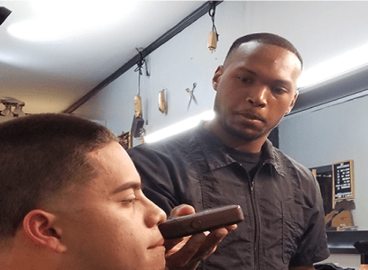
This is a self-initiated, speculative case study inspired by a real problem I've personally experienced. I collaborated with barbershop owners and frequent clients in Lisbon and Braga to ground the work in real insight rather than assumption.
THE CORE CHALLENGE
Traditional barbershops face inefficiencies in managing appointments, coordinating staff schedules, and engaging with customers effectively. Customers often experience long wait times and limited visibility into services or barber availability. Barbers themselves need tools to manage their schedules and communicate with shop owners/admins. A unified, three-module application can address these issues by providing tailored interfaces and functionality for each user group.
The goal was to design a three-module platform: a client-facing booking app, a barber schedule management tool, and a shop owner admin dashboard. This case study focuses on the client-facing module. The barber and admin modules were designed and are available in the Figma file.
SCOPE DECISION
Admin and barber modules are fully designed in Figma. This case study documents the client experience end-to-end, which represented the highest user impact and the most complex design problem.


RESEARCH
This crucial first step provided deeper into the user experience, identifying key challenges and opportunities.
Secondary research, user surveys, stakeholder interviews, and competitor analysis to define the real problem space.
RESEARCH GOALS
01
Understand attitudes toward using a digital barbershop booking experience.
02
03
Analyze competitor solutions to identify gaps in the market.
04
Evaluate how users feel about existing booking methods like WhatsApp and phone calls
05
06
Identify must-have features for client, barber, and admin modules
KEY TAKEAWAYS
The barbershop industry is increasingly adopting digital solutions to improve customer experience, streamline operations, and enhance collaboration among staff. This case study explores the potential for developing a barbershop application composed of three distinct modules: Client, Admin (Shop Owner), and Barber (Collaborator). The research focuses on understanding the feasibility, benefits, and challenges of such an application.
Lack of Unified Systems
Most barbershops rely on fragmented tools (social media, manual bookings), leading to missed appointments and inefficiencies.
Users Want Convenience
Clients seek easy, intuitive ways to view availability, book appointments, and receive reminders.
Users Want Convenience
Many barbers experience frustration due to overlapping bookings, unclear schedules, or last-minute cancellations.
Admins Need Control
Owners want adashboard to track appointments, assign barbers, and manage schedules easily.
Competitive analysis
I analyzed three leading booking platforms to identify where the market falls short for premium barbershop experiences.
Platform
Real-time Availability
Barber Profiles
Admin Dashboard
Loyalty System
Style Matching
Mobile-First
bOOKSY
Threatwell
Styleseat
OUR APP
KEY TAKEAWAYS
The barbershop industry is increasingly adopting digital solutions to improve customer experience, streamline operations, and enhance collaboration among staff. This case study explores the potential for developing a barbershop application composed of three distinct modules: Client, Admin (Shop Owner), and Barber (Collaborator). The research focuses on understanding the feasibility, benefits, and challenges of such an application.
Lack of Unified Systems
Most barbershops rely on fragmented tools (social media, manual bookings), leading to missed appointments and inefficiencies.
Users Want Convenience
Clients seek easy, intuitive ways to view availability, book appointments, and receive reminders.
Users Want Convenience
Many barbers experience frustration due to overlapping bookings, unclear schedules, or last-minute cancellations.
Admins Need Control
Owners want adashboard to track appointments, assign barbers, and manage schedules easily.
No existing platform combines real-time barber availability, style matching, and a loyalty program in a premium mobile experience. That gap is where this product lives.
Competitor Analysis Summary
SURVEYS
Participants were recruited through direct outreach to 3 local barbershops. Survey conducted over 4 weeks in January 2024.
WHAT USERS TOLD US
This research reveals a clear gap between user habits and digital adoption. While customers are loyal to their barbers, the booking experience remains inefficient and fragmented. This creates a strong opportunity for a streamlined, app-based solution that improves convenience without disrupting existing relationships.
Fragmented Booking Experience
68% of users still rely on phone calls or walk-ins to book appointments, leading to long wait times and scheduling conflicts.
Despite this friction, only 35% have used a digital app for booking, highlighting a clear usability or awareness gap rather than lack of demand.
Lack of Unified Systems
While 72% of users have a favorite barbershop or barber, less than 20% were satisfied with the way they currently book appointments. This indicates strong brand loyalty but poor system satisfaction, suggesting a better booking experience could boost retention.
Weekly
15%
Bi-weekly
16%
Monthly
40%
Every few months
20%
Rarely
9%
68%
68%
72%
<20%
Meet Miguel Forcado (USer Persona)
Emerging from research and interviews, Miguel represents the core user segment: urban professionals with irregular schedules, high loyalty to their barber, and zero patience for friction.

Age
Occupation
Income
Hometown
Race
Gender
Family
Miguel forcado is a coffee waiter from the historic Bairro Alto neighborhood in Lisbon, Portugal.Born and raised in the heart of the city, miguel embodies the warm and passionate spirir of lisbon’s hospitality culture. Miguel values time and efficiency. With a busy work schedule, he needs services that fit into his day seamlessly. He frequently books services online and uses apps for everything from transport to food delivery. He enjoys looking polished and visits the barbershop every 3–4 weeks.
GOALS
As a 22 year old man he always wants to maintain a stylish appearance to impress customers at work
Book barbershop appointments quickly from his phone
Find a barber with good reviews and available slots
Get reminders so he doesn’t forget appointments
Find a barber who understands his hair type and preferred styles
Easily book appointments that fit his irregular work schedule
Track loyalty rewards or discounts
FRUSTRATIONS
Limited availability of barber appointments during his free time
Inconsistent quality of haircuts from different barbers
Difficulty in communicating his desired hairstyle effectively
Long wait times at walk-in barbershops
Limited information about barbershop services and prices online
Calling to book feels outdated and inconvenient
Walk-in waiting times disrupt his day
No easy way to compare barbers or services
Interview QUote
"I don’t want to have to call to book an appointment, I need something quicker."
Miguel - User Interview, January 2024
Design Decisions Driven by Miguel
How Miguel shaped the design
His irregular schedule drove the time-constrained booking flow. His inability to preview barber style drove the barber profile cards with portfolio photos. His frustration with phone calls drove the notification and reminder system as a core, not a nice-to-have.
EMPATHY MAPS
Inside miguel´s world
SAYS
"I wish I could book a haircut like I book a taxi"
"I don't want to call , I need something quicker"
"I wish I could just book a haircut like I book a taxi."
"I don’t want to have to call to book an appointment, I need something quicker."
FEELS
Frustrated when can't get appointments easily
Annoyed when appointments aren't honored
Anxious about inconsistent haircut quality
Excited to try new hairstyles
Relieved when the process is smooth and fast
Frustrated with lack of transparency or updates
DOES
Checks barbershop reviews online
Tries to book appointments during off-hours
Experiments with different hairstyles
Uses his iPhone to research grooming trends
THINKS
Wants to look stylish and professional
Concerned about spending too much on grooming
Values his personal style and appearance
Wonders how to find a barber who understands his style
Chapter 02
DEFINE
Researching what stakeholders, barberhshop owners and users needs
DEFINING THE MVP
At this point, I was ready to start defining the features my app would include. I had got to know my target user, and had defined the key problems my user was facing regarding tackling Barbershop appointment booking . With this information in hand, I set out to define my MVP (minimum viable product).
LOOK AND FEEL
In order to design an app that would match its goals and give an immersive experience, I wanted the app to look feel modern. The app has a sleek, modern dark theme with a vibrant shade of blue described as Sky blue color palette, accented by a lighter shade of blue for a premium feel. Also by introducing Smooth animations, rounded elements, and minimalist typography creates an elegant yet functional user experience. I’ll start with the mood board first.
TONE
Sleek & Sophisticated:
Think smooth, clean lines and modern aesthetics. The tone should mirror this feel—smooth, easy-going, but with a hint of mystery.
Edgy & Rebellious:
If the barbershop leans into a more alternative vibe, let the tone have an edgy, rebellious quality. This could be seen in the choice of words, like using slang or slightly unconventional phrasing that still feels natural.
Authentic & Grounded:
No over-the-top fluff. The tone should feel real, as though it’s coming from someone who truly understands the craft of barbering and the culture that comes with it.
Example Phrases:
Booking page: “Let’s get you lined up. Choose your time, and we’ll take care of the rest.”
Welcome message: “Welcome to [Shop Name]. It’s not just a cut, it’s a transformation.”
After service: “Your look is now legendary. See you next time for the next level.”
VOICE
Professional yet Casual:
It’s important to maintain professionalism (after all, it’s a barbershop), but with a relaxed vibe. You want users to feel like they’re engaging with a place that knows its craft but doesn’t take itself too seriously.
Confident & Bold:
The voice should exude self-assurance, aligning with the idea that the barbershop is a place where clients go to look and feel their best. The tone can be unapologetic and cool.
Confident & Bold:
The voice should exude self-assurance, aligning with the idea that the barbershop is a place where clients go to look and feel their best. The tone can be unapologetic and cool.
Inviting:
Use language that feels intriguing, drawing people in without revealing everything. Think of it like a secret, exclusive space that someone has to discover and experience for themselves.
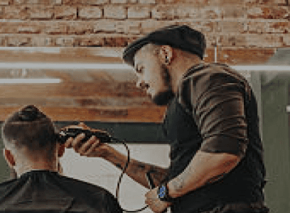
IMAGE Moodboard


Chapter 03
PROTOTYPE
Researching what stakeholders, barberhshop owners and users needs
Architecture, Visual System
& Final Screens
Professional yet Casual:
It’s important to maintain professionalism (after all, it’s a barbershop), but with a relaxed vibe. You want users to feel like they’re engaging with a place that knows its craft but doesn’t take itself too seriously.
Confident & Bold:
The voice should exude self-assurance, aligning with the idea that the barbershop is a place where clients go to look and feel their best. The tone can be unapologetic and cool.
Confident & Bold:
The voice should exude self-assurance, aligning with the idea that the barbershop is a place where clients go to look and feel their best. The tone can be unapologetic and cool.
Inviting:
Use language that feels intriguing, drawing people in without revealing everything. Think of it like a secret, exclusive space that someone has to discover and experience for themselves.
UI STYLE GUIDE
After defining the core problems and solutions, the next step was to translate them into a tangible product.
To do that, I first developed a style guide, a structured system defining the visual language, including typography, color, and component patterns. This ensured consistency and scalability across the product.
Colors
Spacing
Grid
Typography
Spacing
Color SCHEME
The color palette for the Premium Barbershop App reflects sophistication, confidence, and modern masculinity. Deep tones paired with clean neutrals offer a sleek, high-end experience that aligns with the quality of service and grooming excellence our brand represents.
Background Colors
Background Dark
#1F2126
Background Light
#F5F5F5
PRIMARY Colors
A primary color is the color displayed most frequently across your app's screens and components.
It can be your main brand color, or primary accent color that is high-emphasis in the app.
Primary Color
#5C80FF
Primary Container
#C1C7FE
On Primary
#FFFFFF
On Primary Container
#5C80FF
900
800
700
600
500
400
300
200
100
50
Secundary Colors
A secondary color provides more ways to accent and distinguish your product. Having a secondary color is optional, and should be applied sparingly to accent select parts of your UI.
Secundary Color
#8683A1
Secundary Container
#FFFFFF
On Secundary
#FFFFFF
On Secundary Container
#8683A1
900
800
700
600
500
400
300
200
100
50
Neutral colors
Black
#000000
Gray 800
#262626
Gray 600
#555555
Gray 300
#c4c4c4
White
#f5f5f5
INFOrmatioN ARCHITETURE
1
First-time user navigating through the app.
2
Active user navigating through the app.
first time user
FINAL SCREENS


HOME DASHBOARD OVERVIEW
The home screen serves as the central hub, providing a quick snapshot of available services and specialists. It is structured for fast navigation and clear decision-making.
Welcome,
Rui Pirez
friday, 02 march
Our Services
Packs
HAIR
BEARD
FINISHERS
PAINTING
Haircut + Styling
Basic haircut & vitamint
10€
Haircut + Styling
Basic haircut & vitamint
22€
Haircut + Styling
Basic haircut & vitamint
26€
Haircut + Styling
Basic haircut & vitamint
30€
our Top Specialists
Wade Warren
Top Hair Specialist
5.0

John Warren
Hair Specialist
5.0
Lil Wayne
Hair Specialist
5.0
9:41

Premium
Barber shop

A structured list presents the available services within the selected category.Each item clearly communicates:
Service name,Brief descriptiona and Price
A segmented tabs allows users to switch between different service types such as packages, hair, beard , promotions. This enables quick filtering without overwhelming the user with unnecessary options.
A horizontally scrollable section highlights featured professionals. Each card includes:
Specialist image, Name and role, Rating indicator
The bottom navigation provides persistent access to key areas of the app, such as home, bookings, and user profile. Its fixed position ensures smooth navigation across the platform.
TESTING
Testing the solutions and polish the product with the gathered insights
THE MOMENT OF TRUTH
It’s time to take the solution to the test. In this phase, I will test the design that I made in the previous phase. It starts with usability testing and then I’ll do some iterations based on the usability testing. To ensure the app met the needs of my target users, I created a interactive prototype in Figma and tested it with 10 participants. All testers had previously booked appointments online and were familiar with using mobile apps for service-based businesses. I focused on testing essential user flows that would be central to the app’s success. The goals below helped evaluate usability, satisfaction, and motivation.
GOALS
Goal 1
Test overall app functionality and ease of use.
➡️10/10 users said the app felt modern, smooth, and intuitive
Goal 2
Measure ability of users to book an appointment by specialist or service
➡️ 9/10 users preferred booking by service first, then choosing a barber
➡️8/10 users wanted clearer service categories (e.g., beard vs haircut)
➡️ 5/5 completed the booking successfully
Goal 3
Test how well users could navigate the Shop and complete a purchase
➡️ 5/5 users were able to browse and add products to cart
➡️ 2/5 users struggled to find the checkout button quickly
➡️ 4/5 users wanted more product filters (e.g., by hair type)
Goal 4
Assess motivation to return and continue using the app
➡️10/10 users said the app felt modern, smooth, and intuitive
USABILITY TESTING
To test the design, initially I made scenarios to be carried out by the testers.
Those scenarios were :
Use Sign Up & Explore the App
You’re a new user who just downloaded the app.
Sign up, create your profile, and take a few moments to explore the main sections of the app.
Purpose:
Test overall onboarding, navigation clarity, and first impressions.
Book haircut by service type
You need a basic haircut.
Use the app to find a suitable service, choose a time slot, and book your appointment.
Purpose:
Evaluate how easily users can browse services and complete a booking.
Look for a specific barber that you already know
You need a basic haircut.
Use the app to find a suitable service, choose a time slot, and book your appointment.
Purpose:
Evaluate how easily users can browse services and complete a booking.
Time-Constrained Booking
You are only free tomorrow between 1:00 PM and 2:00 PM. Book a haircut within that window.
Purpose:
Assess how easily users can scan availability, understand time slots, and complete
bookings under time pressure.
Modify Existing Booking
You’ve already booked a haircut, but now you need to change the time. Update your appointment.
Purpose:
Assess flexibility of the system, ease of editing vs canceling, and whether users understand consequences (fees, availability changes).
Cancellation Transparency
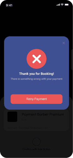
You might need to cancel your booking. Check what happens if you cancel and decide whether to proceed.
Purpose:
Evaluate clarity of cancellation policies, trustworthiness, and whether users feel safe committing to a booking.
Chapter 05
NEXT STEPS
Testing the solutions and polish the product with the gathered insights
NEXT STEPS
Create a better and smooth onboarding experience for first time users.
Collaborate with developers to begin building the MVP (Minimum Viable Product).
Test continuously: Gather feedback from real users as the product evolves to iterate and scale.
Test continuously: Gather feedback from real users as the product evolves.
Launch a beta version with selected barbershops to validate the solution in a live environment.
Monitor engagement and performance metrics to inform future updates and improvements.
REFLECTIONS
The whole design process of this study case was super fun for me. I got to learn a lot. I had to find solutions for a problem i had and also got new problems that i never thought some people went through going to barbershops and some were unique and some were understandable. What began as a vague frustration around barbershop bookings transformed into a deeply researched, thoughtfully designed, and validated solution. It reinforced that real innovation happens when we slow down to listen, collaborate, test, and adapt. This project not only deepened my UX desiGgn skills but also emphasized the value of cross-functional empathy, iterative thinking, and constant learning. I’m excited to carry these lessons forward into future work and continue solving real problems for real people. This Case Study is far from perfect but my intention is to improve it in the future .
LEARNINGS
Digital convenience is non-negotiable nowadays
Users expect seamless, mobile-first experiences and will avoid services that don’t offer modern digital tools.
Frustrations are shared across roles
Barbers, admins, and clients all experience different aspects of the same broken process.
A unified solution could greatly streamline operations.
User trust comes from transparency
Visibility into schedules, pricing, and barber profiles directly influences user confidence and satisfaction.
Empathy drives clarity
Understanding the frustrations and goals of barbers, shop owners, and clients helped define meaningful and focused problems.
Design is never one-size-fits-all
The solution must cater to different user types with tailored interfaces and workflows.
THANK YOU FOR WATCHING!!!
Want to start working on your next project with me?